My first experience with Ragnarson - a logo design

There comes a time in your life when you apply for a job. Sometimes, your potential employer gives you a recruitment task to check your skills and qualifications. When applying to Ragnarson, one of my tasks was to redesign the existing logo. In this post, I will guide you through all stages of this challenge, showing my thoughts about the design process and how it influenced the development of our company's visual identity.
There were a lot of things to do and, as usual, little time for everything. At such moments, it's important to organize your work wisely and divide it into smaller parts. I always start with the research.
Research (a.k.a. what's up with the competitors)
I check logos and visual identity of other companies with a similar profile. I browse their websites and analyze them, considering in which direction I want to go and what I prefer to avoid. Sometimes the research takes longer than expected, sometimes shorter — it depends on the industry and how much knowledge we have in a particular field. Research helps us to design something unique, so remember this step.
Keep calm and stay focused
When I have gathered enough images and information in my mind, I move to the next step and focus only on the company for which I design. I analyze its profile and target group; I hold an interview with the client to learn the specifications. In this case, the logo was supposed to be minimalist. Ragnarson had only a lettering logo, so I thought it would be a good idea to create a sign which could function independently and make the brand more recognizable.
Sketch for the win
The next step is sketching — it's very important because you can quickly reject the bad ideas and develop these which are better, all in a fast and efficient way. Try to sketch as much as possible, everything that comes to your mind. Moving one concept to the paper can beget another, that turns out to be the final product.
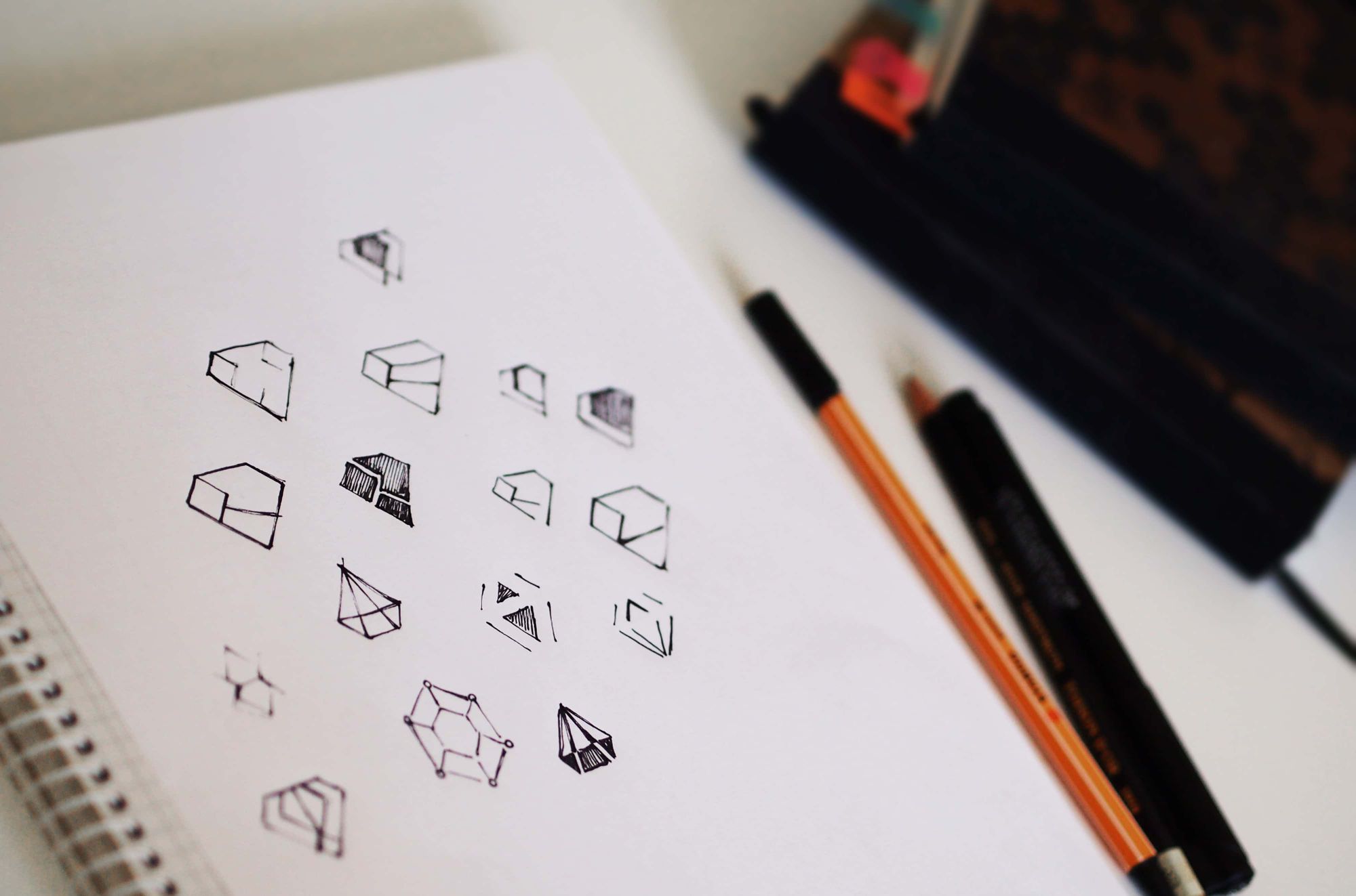
Many lightbulbs with ideas
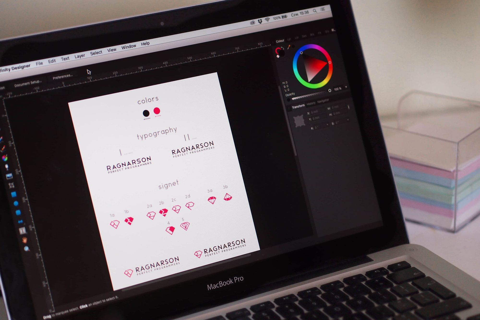
When I have selected a few of my best ideas, I draw my proposals in a graphics program, so that I can show them to the client. You can also show your sketches — it's a good solution for some complex projects because it allows for quick rejection — but in this case, the logo was so simple that drawing it wasn't a problem.
Use hypnosis (kidding, just show a concept)
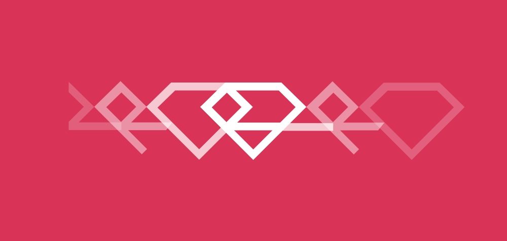
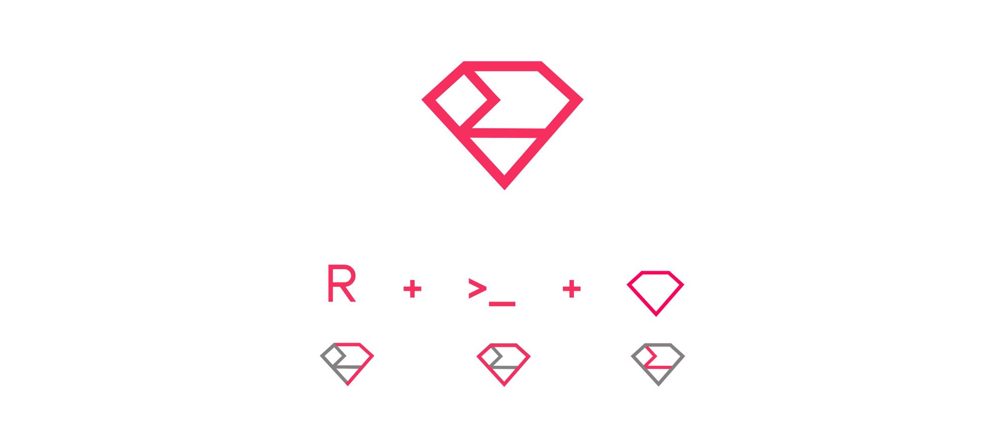
If you want to provide the customer with a few suggestions, but one of them is your absolute favorite, you can work psychologically to convince him or her of your choice. Introduce the idea that shaped the logo in a particular way. It doesn't have to be visible at first glance — the most important thing here is that it shouldn't be just a pretty picture that may represent every company or industry. You need to be aware of why the logo looks the way it looks and give a reasonable explanation of your design decisions. In this case, the concept was based on three elements: ruby shape (which symbolizes Ruby programming language), the R letter (from the first letter of the company's name) and the Terminal sign > _ connected directly to programming.
Acceptance (every designer's desire)
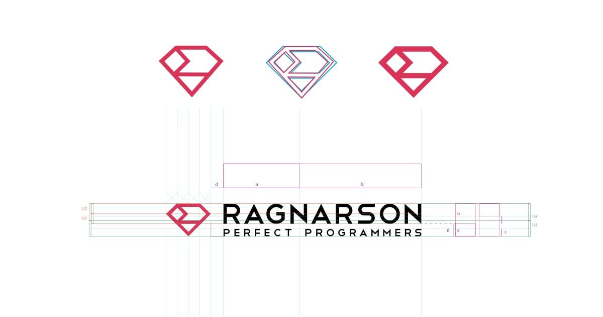
The people from Ragnarson were really into this new concept, so it has been accepted not only as a recruitment task but also as a new logo. The graphic designer from the company has made a few visual fixes and now the logo presents like this:
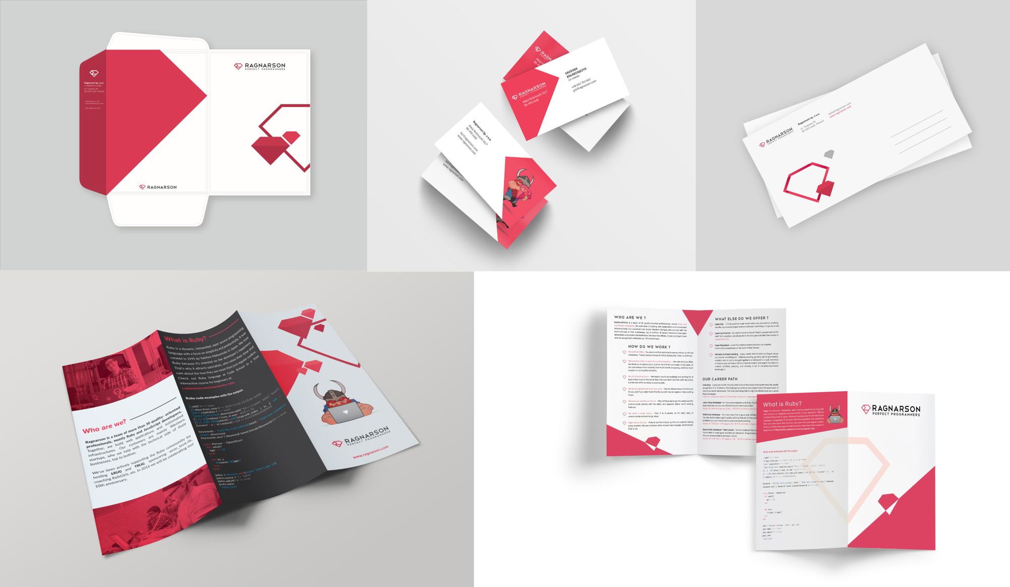
The introduction of a new logo turned out to be crucial in the development of our visual identity. That's how the business cards, folders, and leaflets are now presenting — the projects were based on a redesigned logo idea so that they're visually consistent and recognizable.
Summary
This was my first such serious project, which makes me all the more glad that it has been received positively. With this challenging experience, I've started my adventure with Ragnarson which, I hope, will be long lasting.